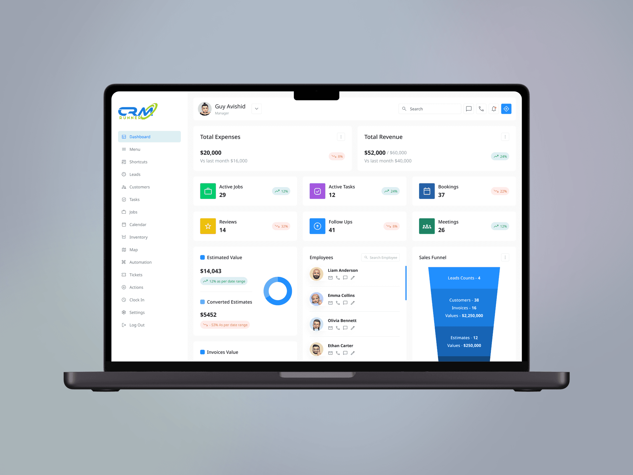
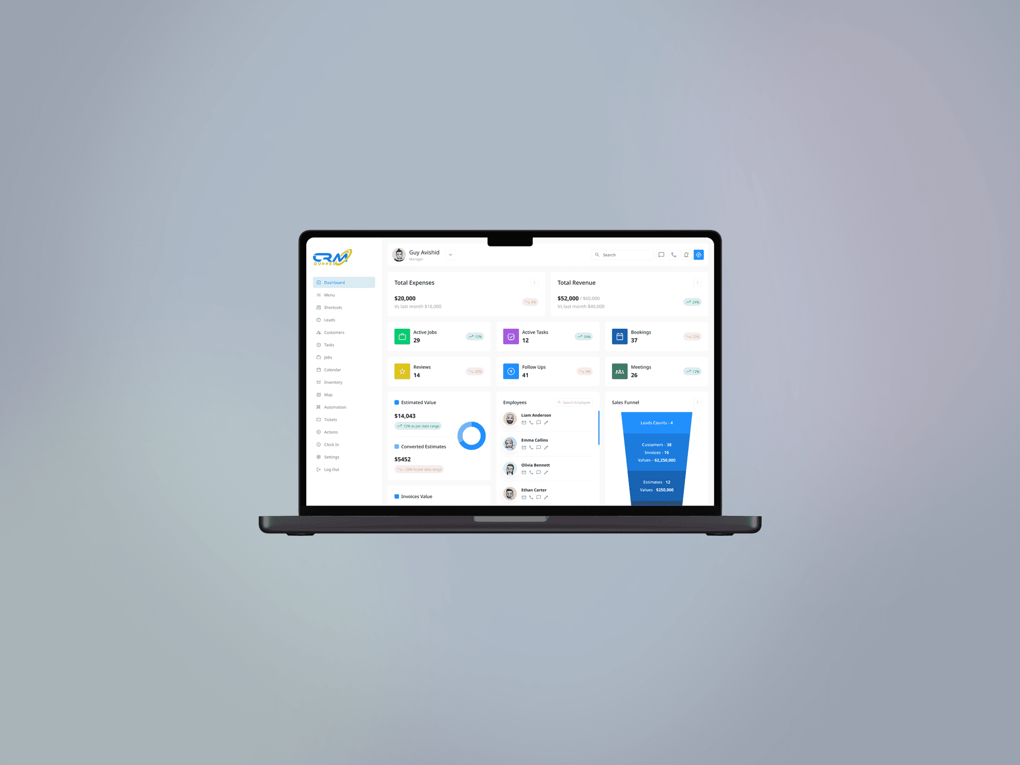
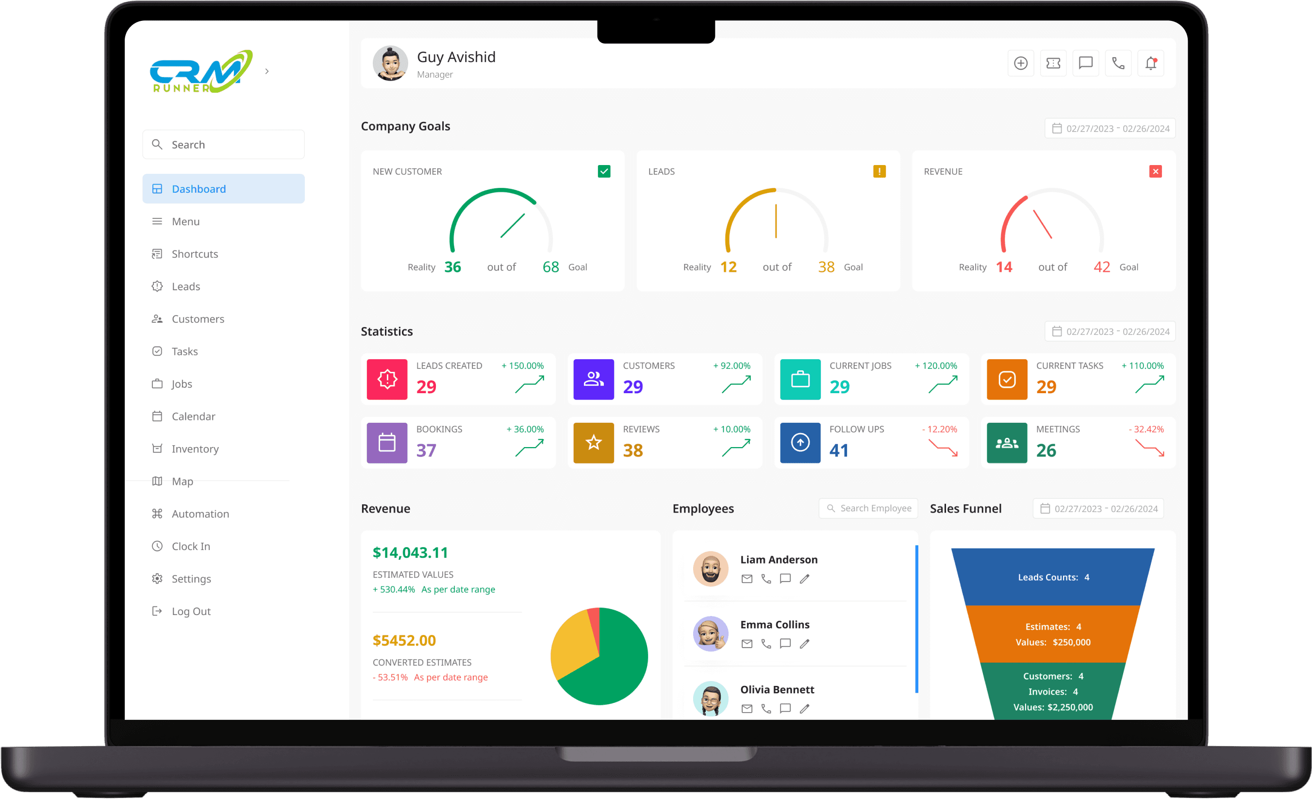
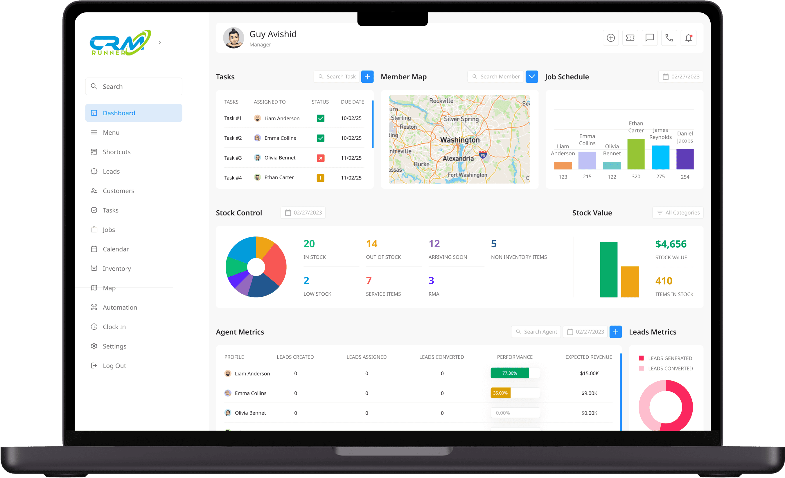
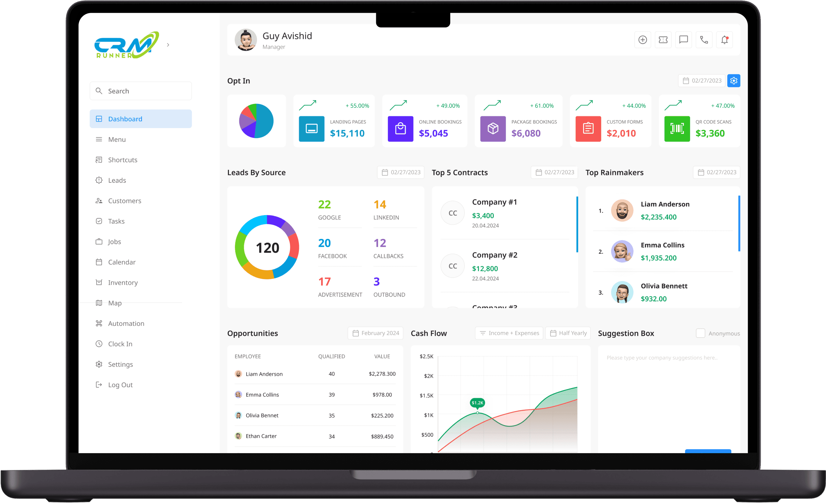
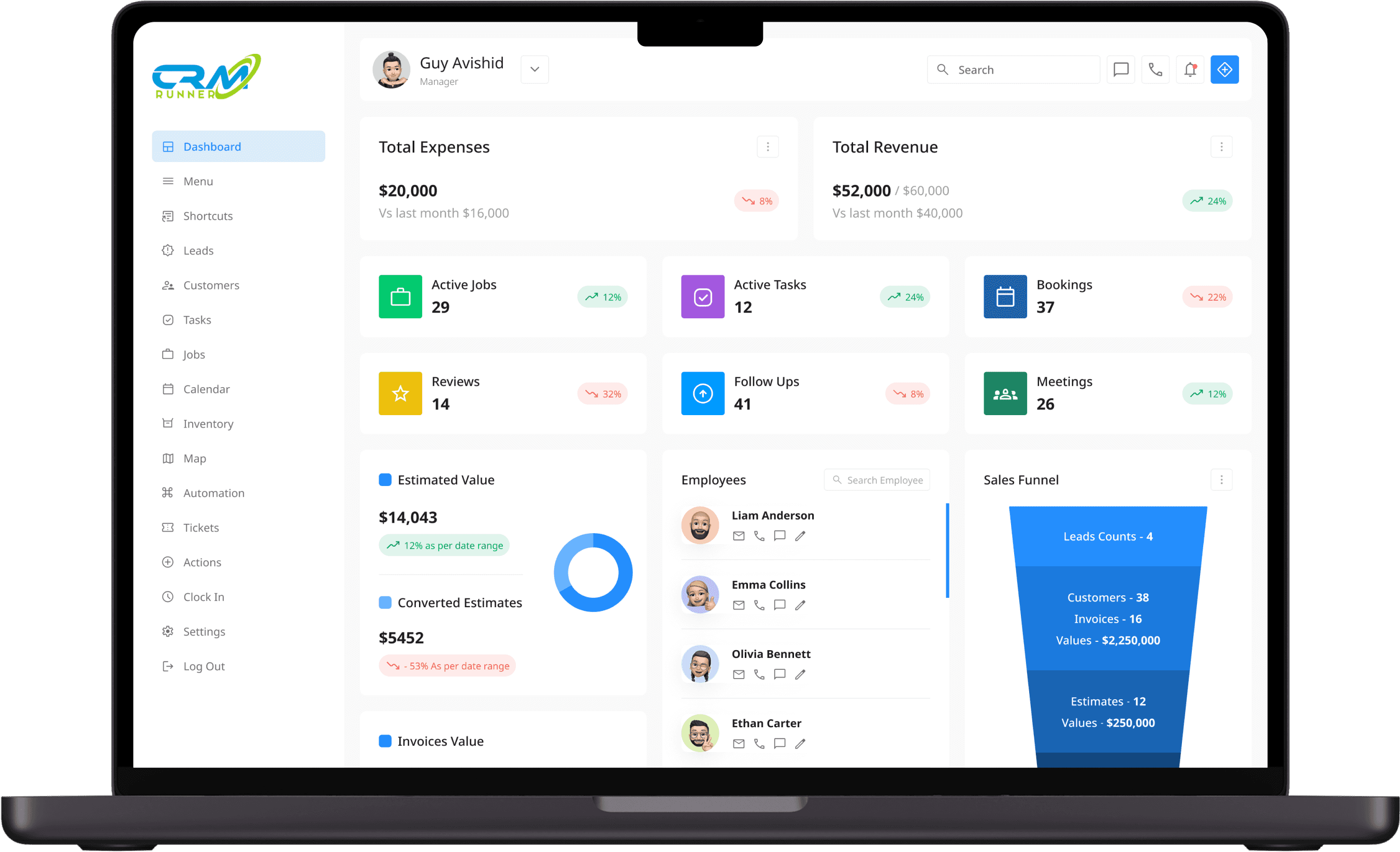
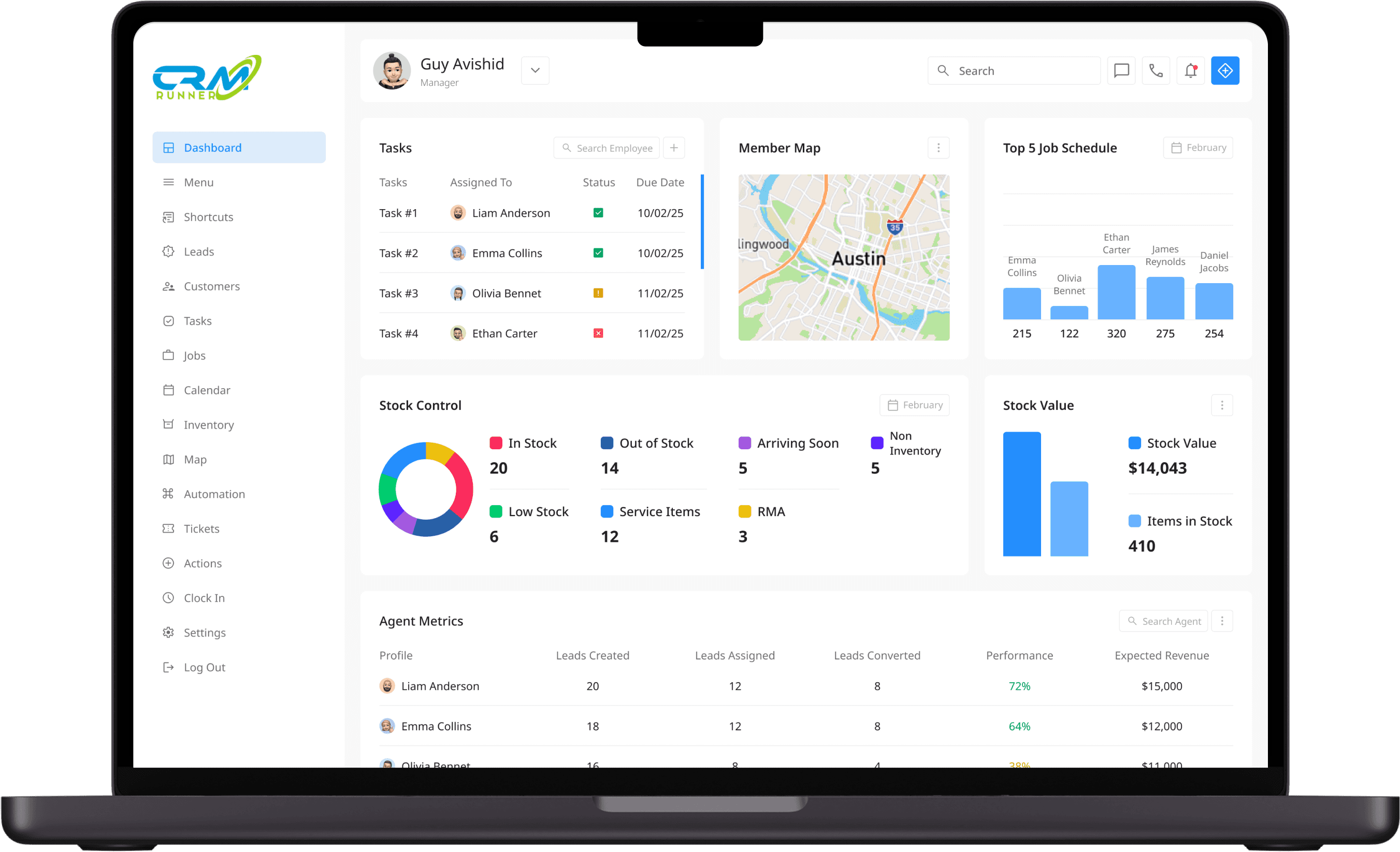
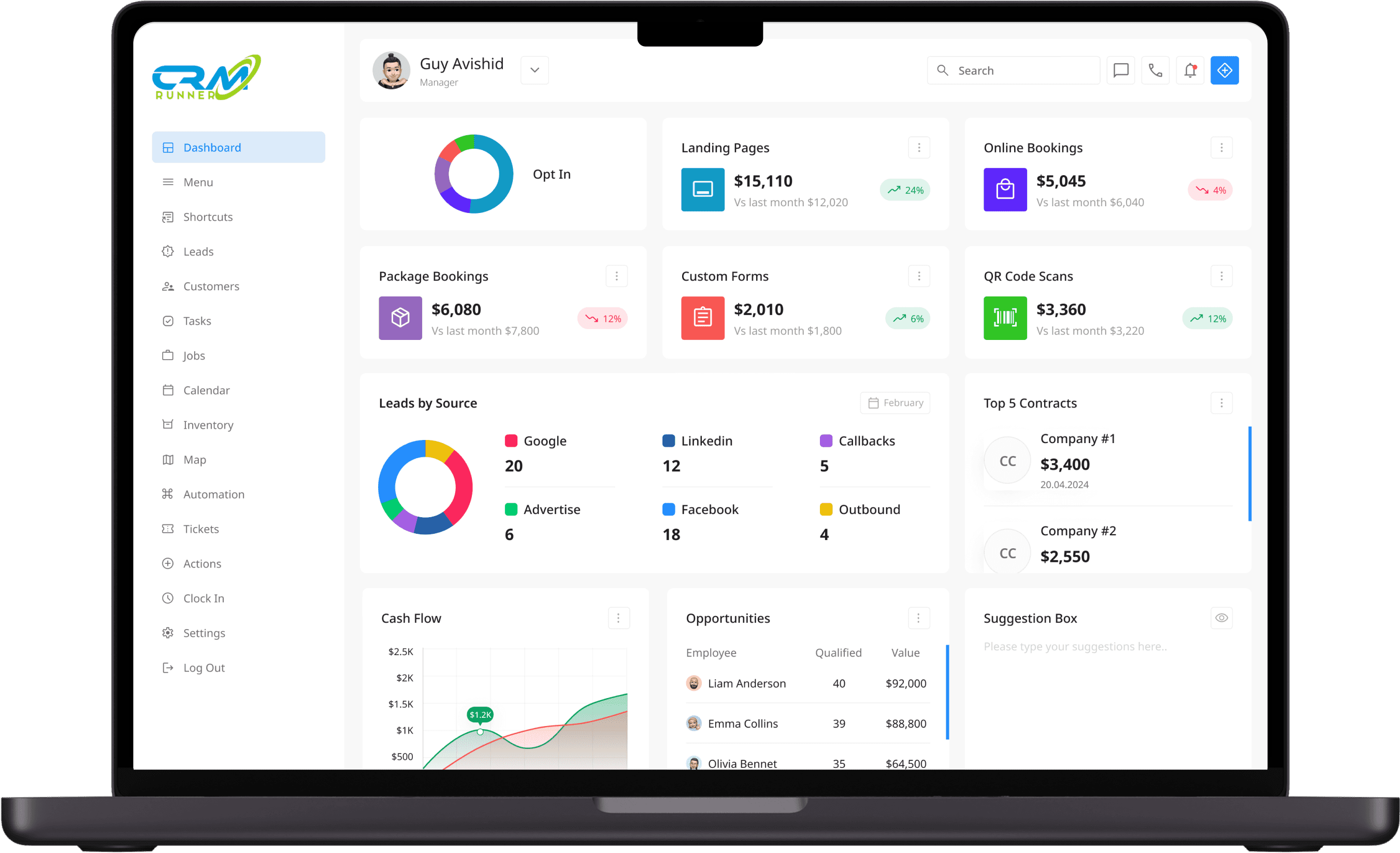
A dashboard for businesses to boost their customer interactions.
CRM Runner is a project I worked on to make managing customer relationships easier and more efficient. I gave the platform a fresh redesign, focusing on improving its functionality and creating a user-friendly interface so businesses can stay organized and get things done without the hassle.
Project Time:
1.5 Months
Tools:
My Role:
Goal: Identify what works and what needs improvement.
Goal: Find gaps and opportunities to create a better design.
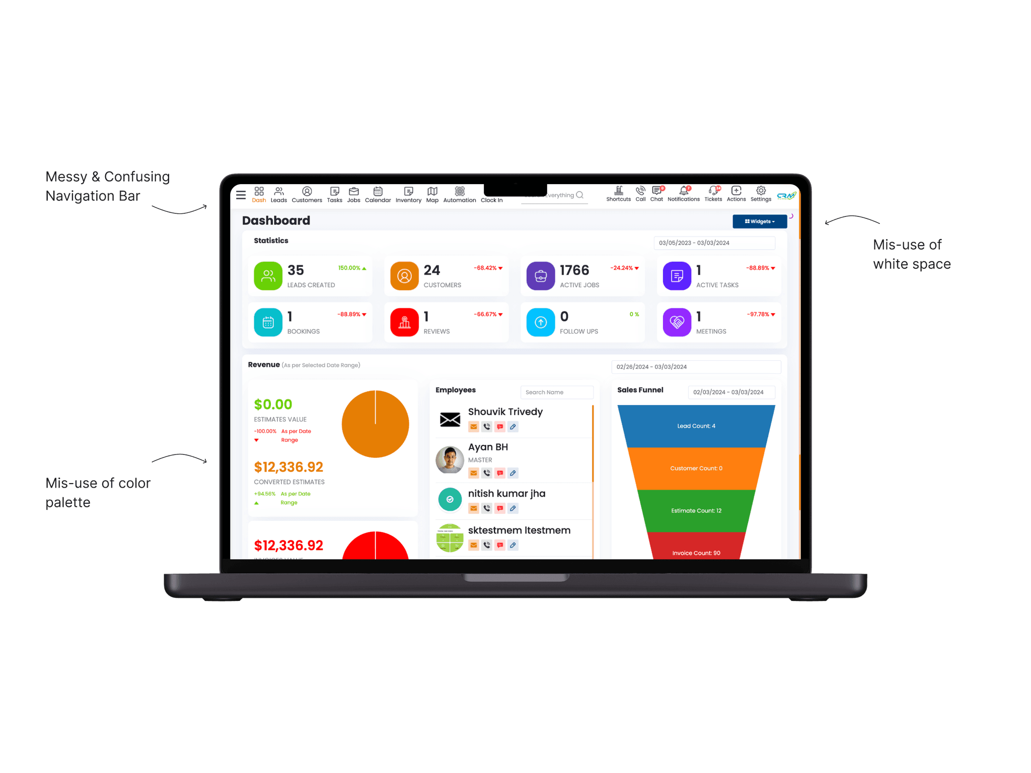
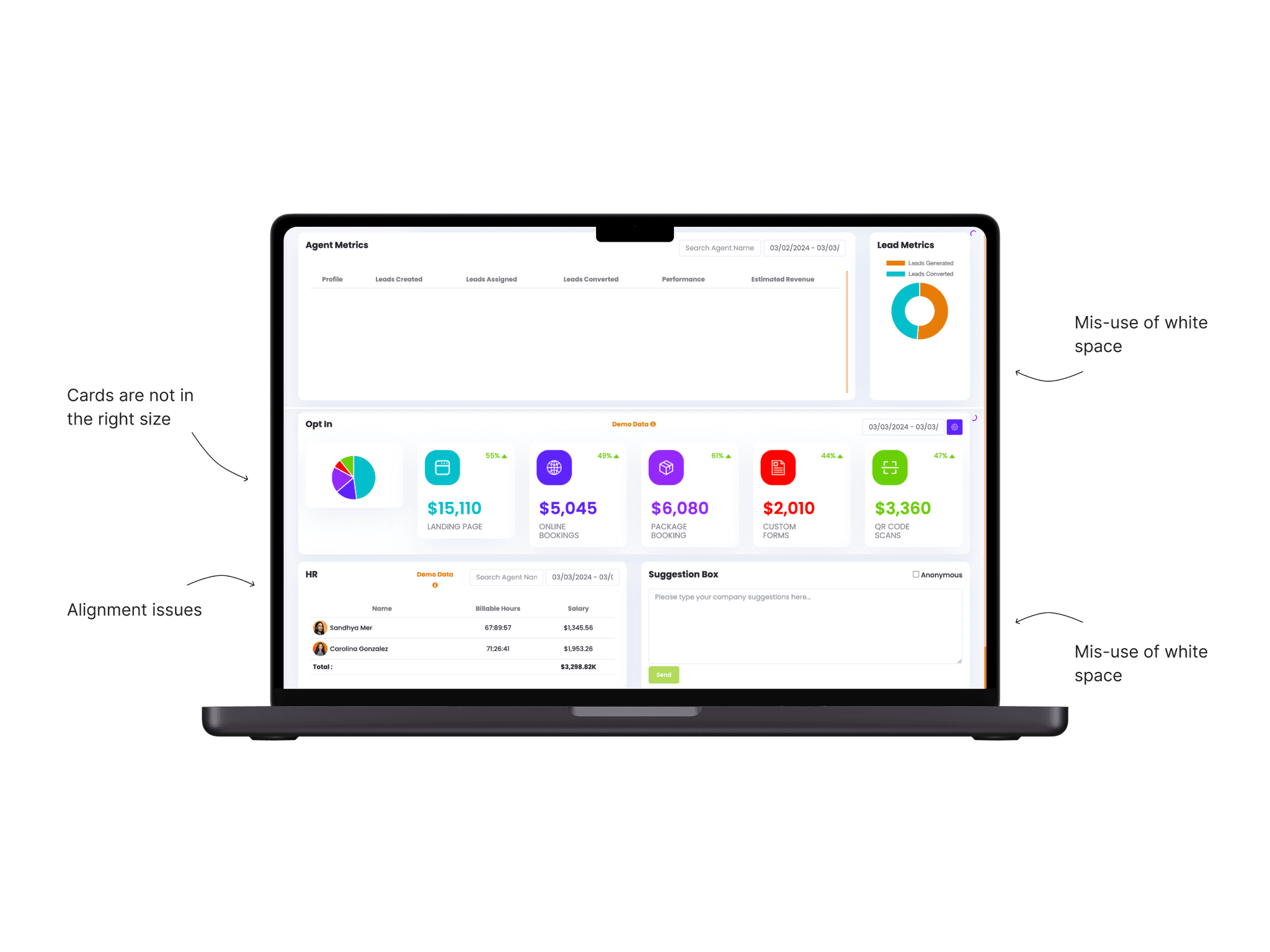
I conducted a detailed comparison between CRM Runner and leading CRM platforms like HubSpot and Monday.com. This analysis helped highlight areas where CRM Runner could improve, such as streamlining workflows, simplifying navigation, and adding more user-friendly visuals.
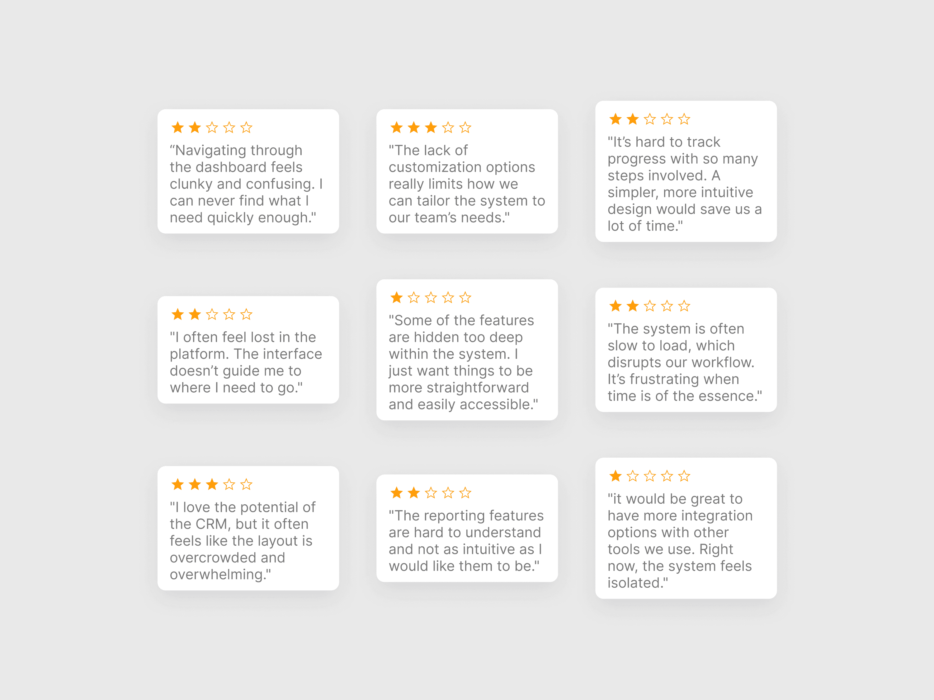
Goal: Get a clear picture of what users find frustrating and what they value.
I collected feedback from current users through surveys and interviews. Their input highlighted key pain points like complex navigation and lack of clarity in certain features, which became focal points for the redesign.
Goal: Establish a foundation for a cleaner, more intuitive system.
I sketched wireframes focusing on improving the platform’s usability. This included simplifying the navigation structure, grouping related features, and improving the visual hierarchy to guide users intuitively through the system.
Goal: Refine the layout of essential tools to improve usability.
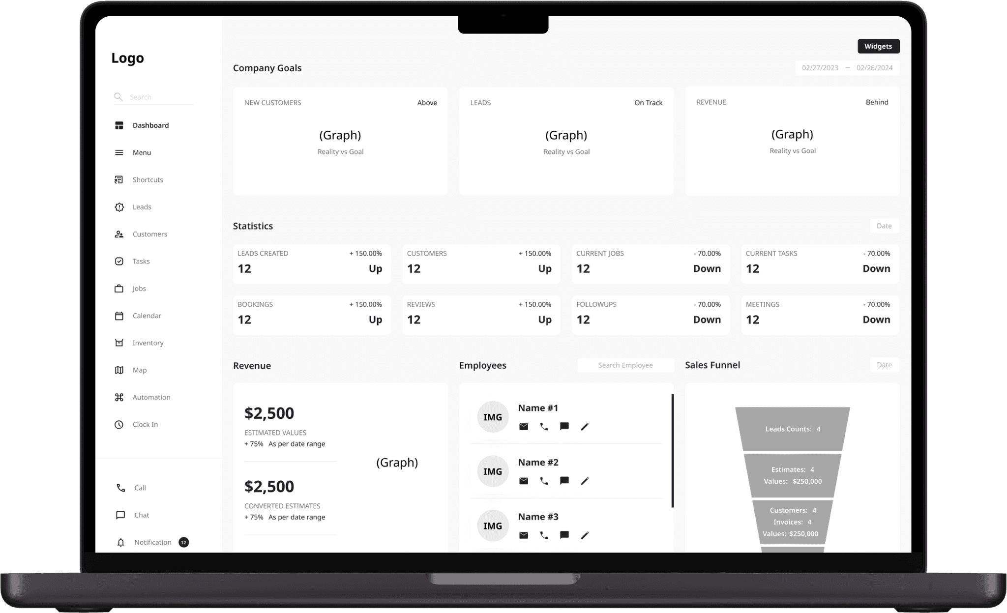
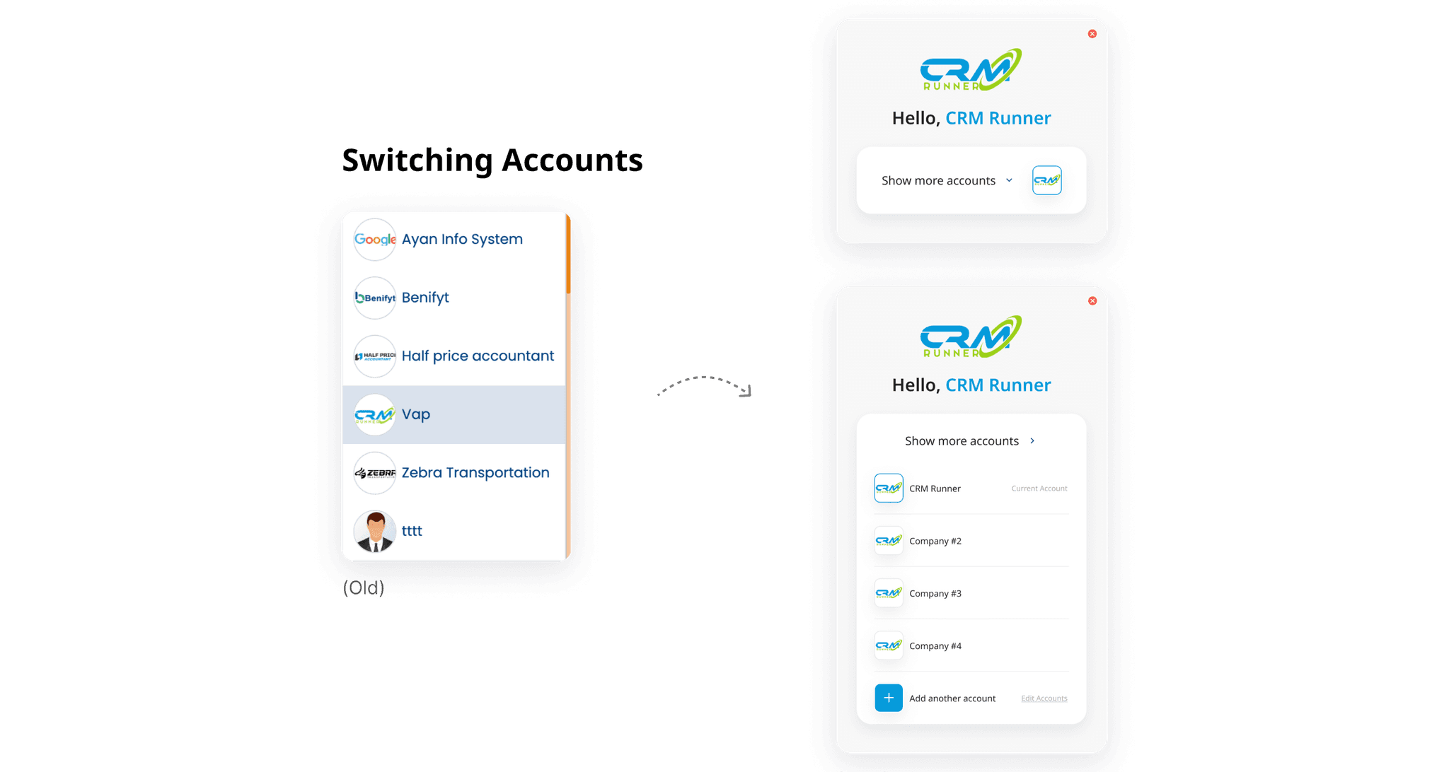
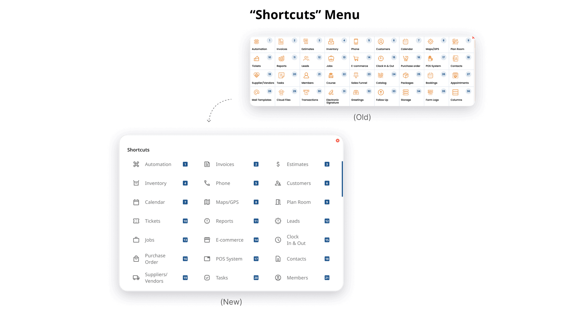
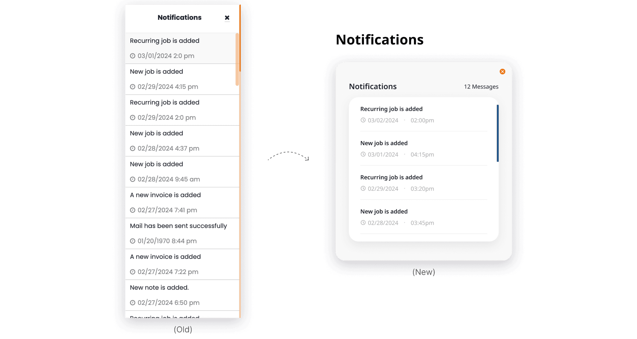
The redesign focused on adjusting layouts rather than completely reworking the platform. By simplifying and reorganizing how users interact with critical tools, the updates made the features feel more intuitive and easier to access. This approach preserved the system’s core functionality while addressing usability pain points like cluttered screens and inefficient navigation. The goal was to enhance clarity and streamline workflows, ensuring that users could quickly and efficiently complete their tasks.
Goal: Create a testable first version to gather feedback directly from real users.
I focused on designing a version that streamlined existing features while preserving familiarity for users of the original system. This included reworking the layout for clarity, reorganizing key tools for better accessibility, and modernizing the UI to align with user expectations. I prioritized intuitive workflows, ensuring the design addressed common pain points without overwhelming users with drastic changes.
Goal: Refine the design through user feedback to resolve issues and enhance efficiency.
After testing the initial version with real users, I gathered feedback on usability, flow, and functionality. Observing challenges like navigation inefficiencies and unclear actions, I refined the design to address these issues. Iterative testing allowed me to create a final version that balanced usability with the platform's business needs, delivering a solution that met user expectations and improved overall efficiency.
© Guy Avishid 2024
