

Inner Cosmos
Inner Cosmos
Inner Cosmos
A mobile app connecting mental health patients with doctors, raising $2 million in funding.
A mobile app connecting mental health patients with doctors, raising $2 million in funding.
A mobile app connecting mental health patients with doctors, raising $2 million in funding.
Introduction
Introduction
What is the project about?
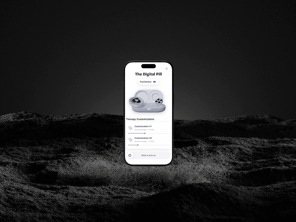
Inner Cosmos is a groundbreaking mental health solution combining a physical "Digital Pill" and an app to deliver targeted treatments. The app allows users to activate their treatment sessions with ease, ensuring accessibility and efficiency for real-world mental health needs.
Challenge
Challenge
What challenge does this project solve?
Activating a health treatment via a digital interface requires precision and simplicity. Any confusion or inefficiency could discourage use or delay care. The challenge was to design an app that made activating the treatment intuitive, reducing friction and building user confidence.
Project Time:
1 Month
Tools:
Figma
Figma,
Notion
Notion,
Cinema4D
My Role:
Research
Research,
Wireframing
Wireframing,
UX&UI
Figma,


Step 1: Interviewing Potential Users
Step 1: Interviewing Potential Users
Step 1: Interviewing Potential Users
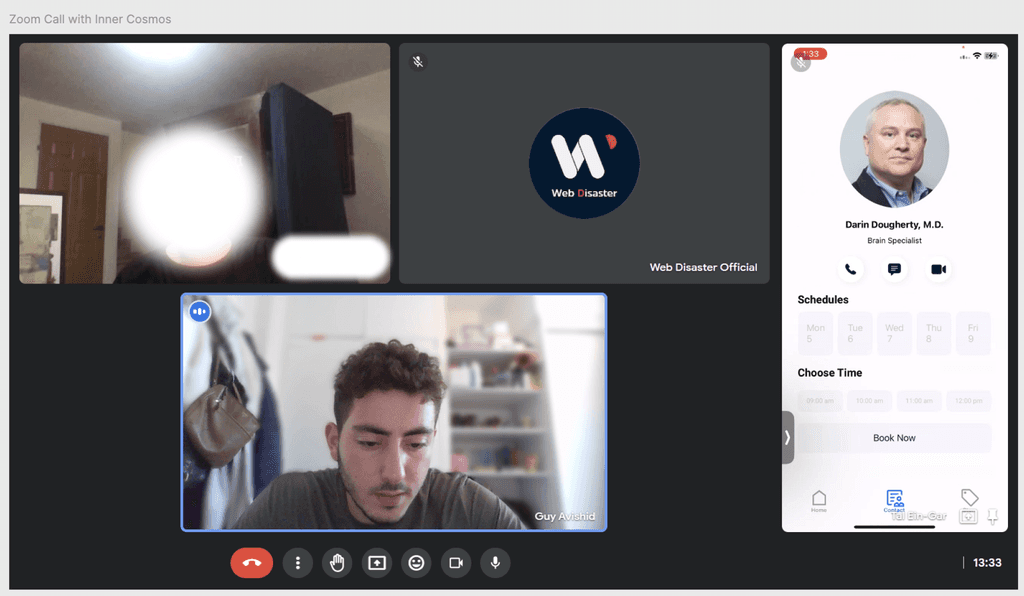
Before sketching any screens, I began by interviewing potential users to understand their mental health journeys, focusing on what would make the app supportive and easy to use. This insight formed the foundation of my design.
Before sketching any screens, I began by interviewing potential users to understand their mental health journeys, focusing on what would make the app supportive and easy to use. This insight formed the foundation of my design.


Step 2: Ideation and Wireframing
Step 2: Ideation and Wireframing
Step 2: Ideation and Wireframing
Brainstorming
Brainstorming
I started by imagining what would make starting a treatment feel natural and stress-free. The goal was to create a design that wouldn’t overwhelm users but would instead guide them gently into their treatment experience. I focused on keeping everything clear, calm, and intuitive so that users could move from screen to screen with confidence.
I started by imagining what would make starting a treatment feel natural and stress-free. The goal was to create a design that wouldn’t overwhelm users but would instead guide them gently into their treatment experience. I focused on keeping everything clear, calm, and intuitive so that users could move from screen to screen with confidence.
Building the Structure
Building the Structure
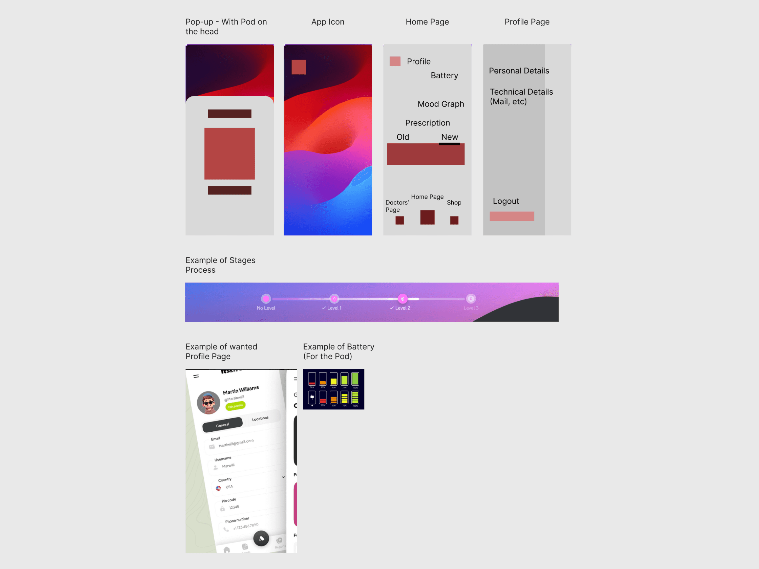
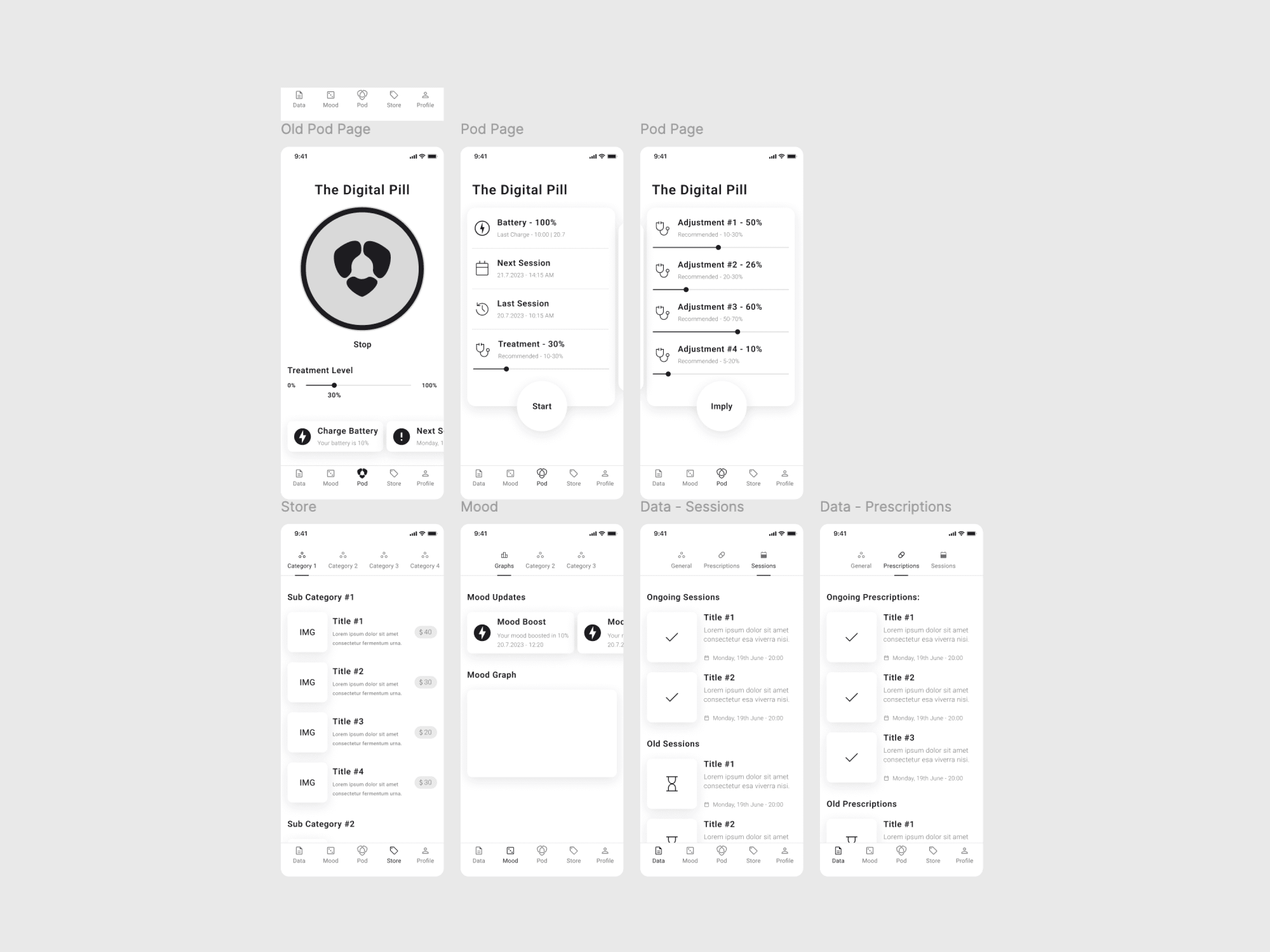
With that vision in mind, I mapped out simple wireframes designed for ease. Each screen was crafted to help users start their sessions seamlessly, with an intuitive layout that let the experience feel as straightforward as possible.
With that vision in mind, I mapped out simple wireframes designed for ease. Each screen was crafted to help users start their sessions seamlessly, with an intuitive layout that let the experience feel as straightforward as possible.


Step 3: Testing on Real Users
Step 3: Testing on Real Users
Step 3: Testing on Real Users
With wireframes ready, I invited real users to test it out, watching where they hesitated and listening to their thoughts. This led to small but impactful tweaks that made the app even easier to navigate. Based on feedback, I adjusted elements like button placement and flow consistency, refining every part to make users feel comfortable.
With wireframes ready, I invited real users to test it out, watching where they hesitated and listening to their thoughts. This led to small but impactful tweaks that made the app even easier to navigate. Based on feedback, I adjusted elements like button placement and flow consistency, refining every part to make users feel comfortable.


Step 4: Bringing the Designs to Life
Step 4: Bringing the Designs to Life
Step 4: Bringing the Designs to Life
Final Look and Execution
Final Look and Execution
The wireframe phase was instrumental in refining how users started treatments. Through early prototypes, I pinpointed exactly where users felt hesitant and clarified the flow to help them begin a session seamlessly. This groundwork made the final design far more intuitive - allowing users to launch into treatments quickly and without unnecessary steps.
The wireframe phase was instrumental in refining how users started treatments. Through early prototypes, I pinpointed exactly where users felt hesitant and clarified the flow to help them begin a session seamlessly. This groundwork made the final design far more intuitive - allowing users to launch into treatments quickly and without unnecessary steps.
The Final Version of the "Start Treatment" Process
The Final Version of the "Start Treatment" Process
The Final Version of the "Start Treatment" Process
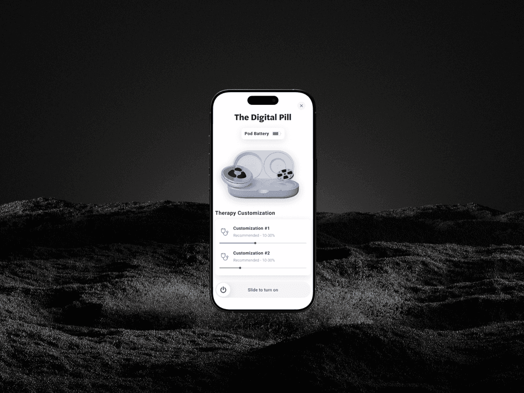
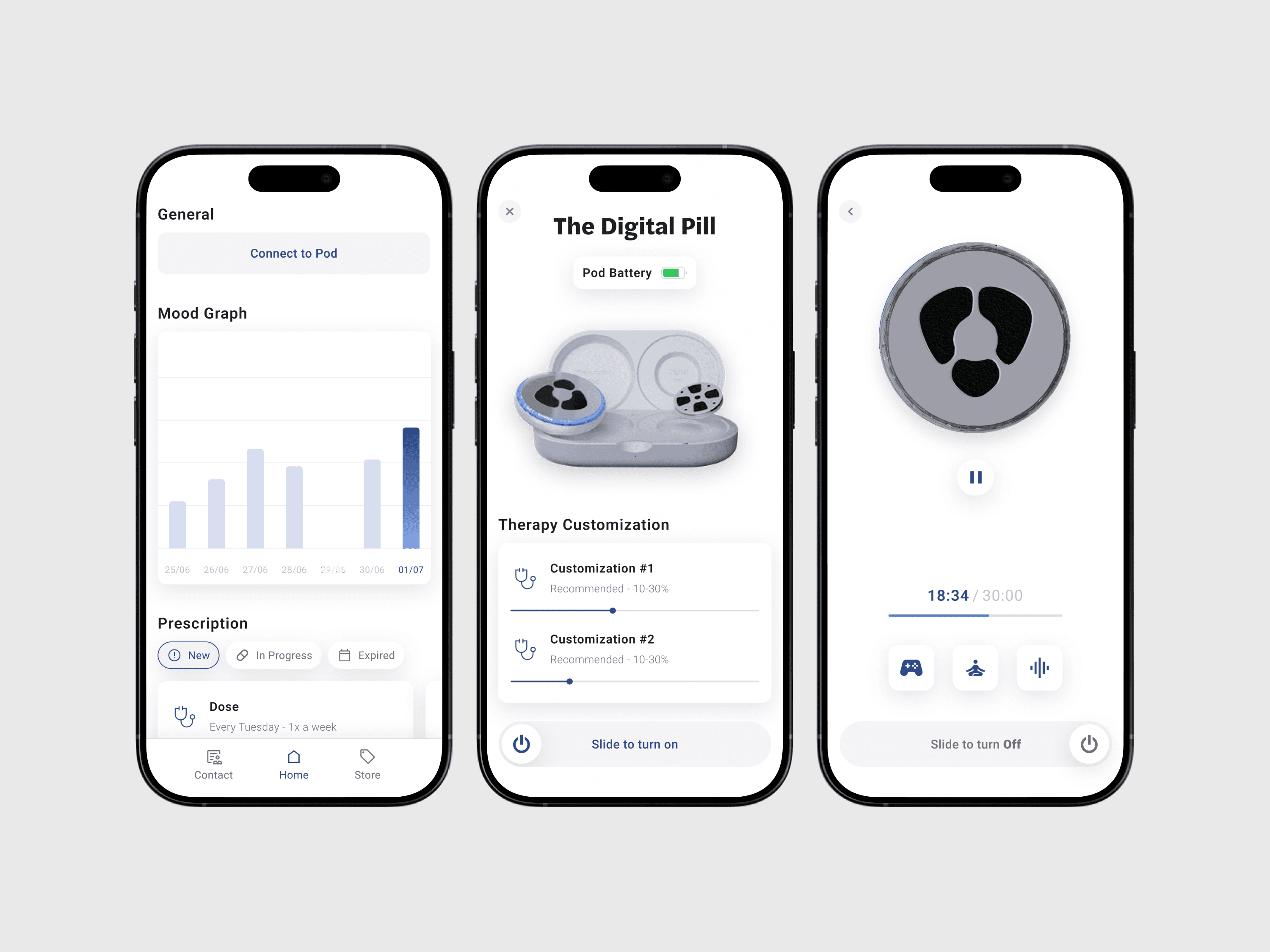
The final design featured a clear “Log Into Pod” button right on the homepage, making it easy for users to jump into their sessions with calming visuals and straightforward options. To avoid any accidental starts, I added a “slide to turn on” feature, allowing users to confirm they’re ready before beginning their treatment. Once they completed this step, they could smoothly transition into their session, creating a supportive atmosphere where they felt in control of their experience.
The final design featured a clear “Log Into Pod” button right on the homepage, making it easy for users to jump into their sessions with calming visuals and straightforward options. To avoid any accidental starts, I added a “slide to turn on” feature, allowing users to confirm they’re ready before beginning their treatment. Once they completed this step, they could smoothly transition into their session, creating a supportive atmosphere where they felt in control of their experience.
What makes the design effective?
What makes the design effective?
What makes the design effective?
One-Tap Treatment Activation: A straightforward interface lets users start treatments quickly and with confidence.
Real-Time Feedback: The app provides immediate confirmation and feedback once the treatment is activated, reducing uncertainty.
Critical Health Monitoring: Integrated visuals and notifications keep users informed about the treatment process without overwhelming them.
Looking Back
Looking Back
Looking Back
This project showed me the impact of empathetic design in mental health tech. With more time, I’d build out onboarding tools to help users feel even more at home right from the start.
This project showed me the impact of empathetic design in mental health tech. With more time, I’d build out onboarding tools to help users feel even more at home right from the start.
Additional Information
Additional Information
Additional Information
The Inner Cosmos app caught the attention of investors, raising an impressive $2 million in funding. This interest highlights the growing belief in the power of neurotechnology to transform mental health care. Investors were excited about the app’s user-friendly design and the positive feedback from early users, which showed it could truly make a difference in managing depression. This funding will help us enhance the app further and reach even more people seeking support.
The Inner Cosmos app caught the attention of investors, raising an impressive $2 million in funding. This interest highlights the growing belief in the power of neurotechnology to transform mental health care. Investors were excited about the app’s user-friendly design and the positive feedback from early users, which showed it could truly make a difference in managing depression. This funding will help us enhance the app further and reach even more people seeking support.