RecruitHQ

RecruitHQ

RecruitHQ

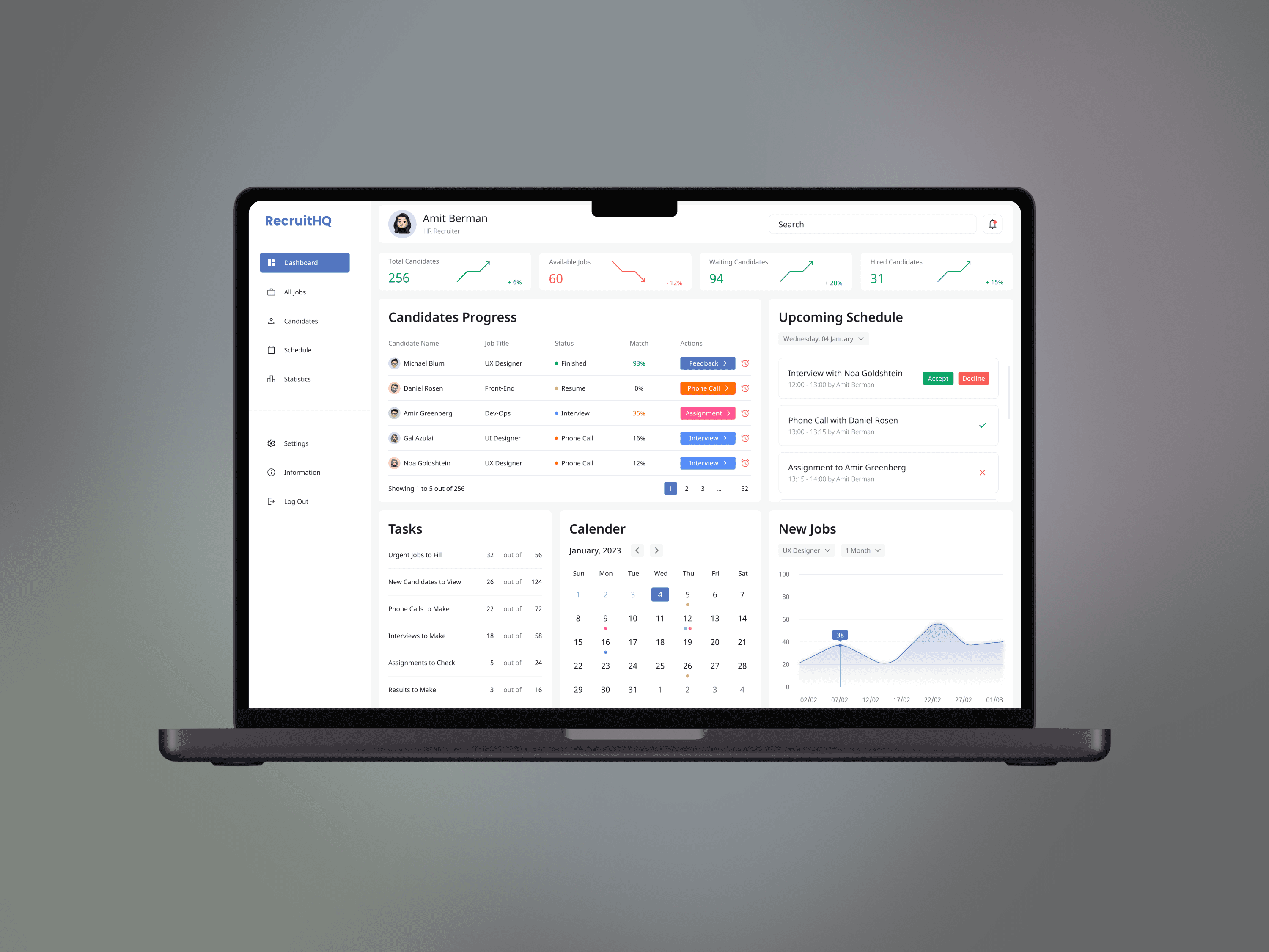
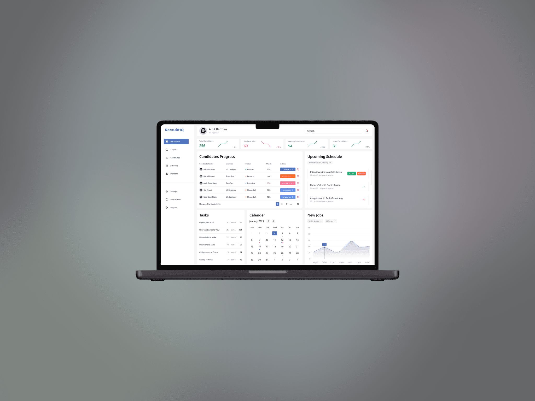
A dashboard that enables recruiters to track progress and analyze performance.

A dashboard that enables recruiters to track progress and analyze performance.

General

General

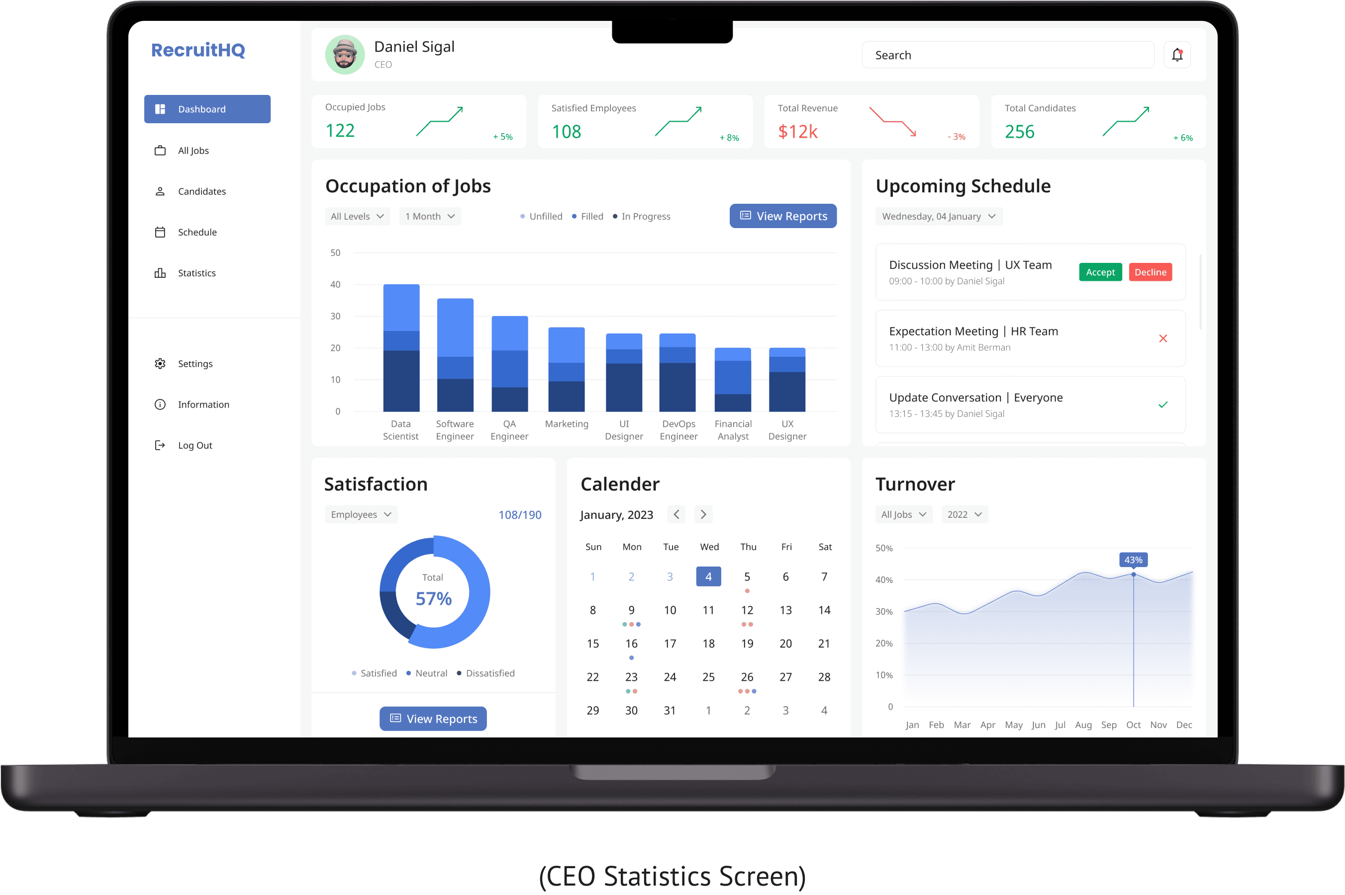
RecruitHQ is a fictional project I created, inspired by the need to make recruitment easier and more effective. It’s built to help recruiters and CEOs stay organized and make confident decisions with real-time data and clear insights.

RecruitHQ is a fictional project I created, inspired by the need to make recruitment easier and more effective. It’s built to help recruiters and CEOs stay organized and make confident decisions with real-time data and clear insights.

Challenge

Challenge

The main challenge in designing a recruitment dashboard is making it feel easy and supportive. Recruiters and CEOs need a clear, organized interface that helps them navigate tasks with confidence, ensuring they can manage the hiring process efficiently without feeling overwhelmed.

The main challenge in designing a recruitment dashboard is making it feel easy and supportive. Recruiters and CEOs need a clear, organized interface that helps them navigate tasks with confidence, ensuring they can manage the hiring process efficiently without feeling overwhelmed.

Solution

Solution

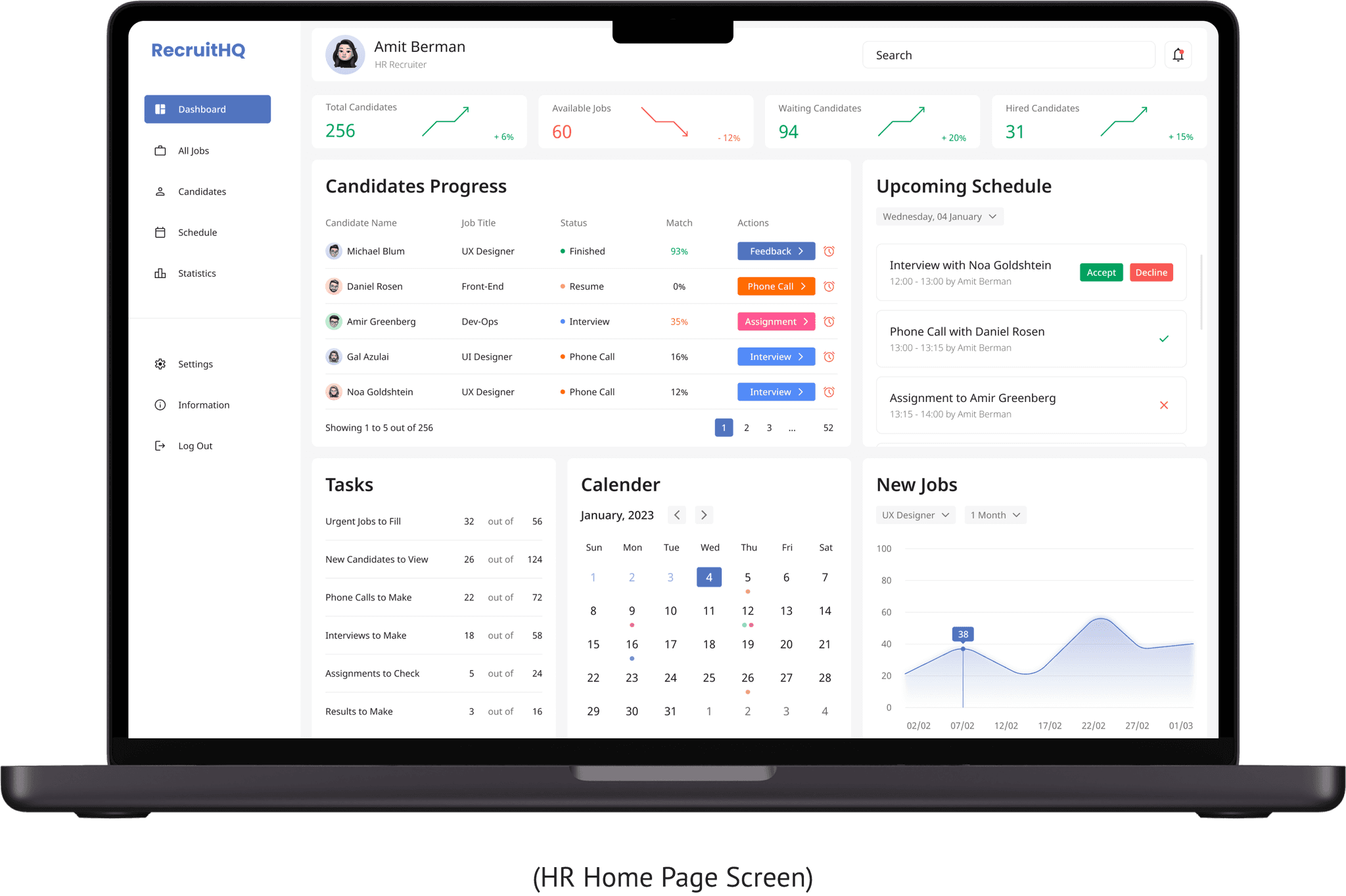
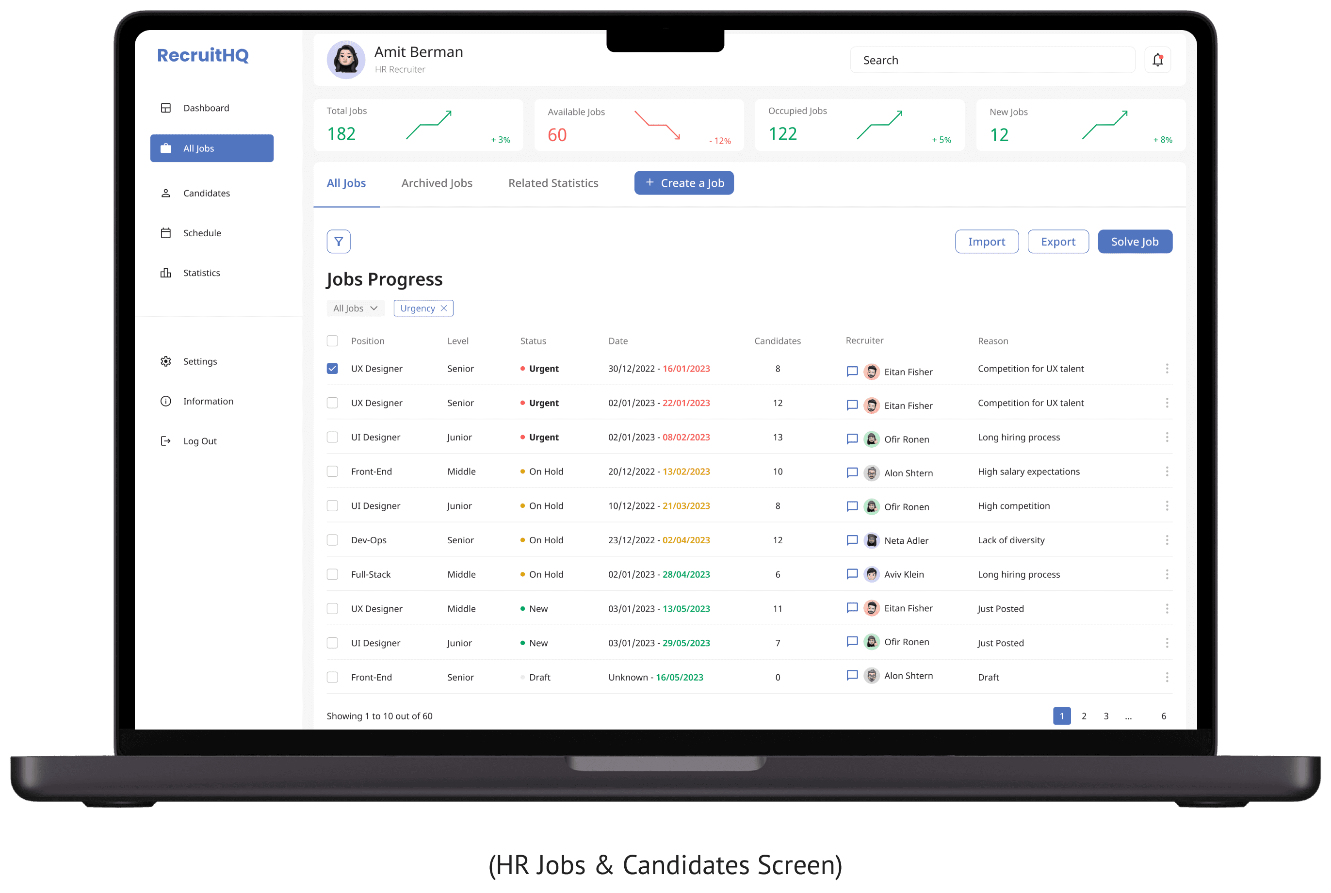
Creating a dashboard with candidate comparison tools, real-time progress tracking, task management, decision-making aids, integrated calendar for interviews, automated status updates, and collaboration features for feedback sharing between recruiters and CEOs.

Creating a dashboard with candidate comparison tools, real-time progress tracking, task management, decision-making aids, integrated calendar for interviews, automated status updates, and collaboration features for feedback sharing between recruiters and CEOs.

Project Time:

1 Month

Tools:

Figma

Figma,

My Role:

Research

Research,

Wireframing

Wireframing,

UX&UI

Figma,

Collecting Inspirations

Collecting Inspirations

Collecting Inspirations

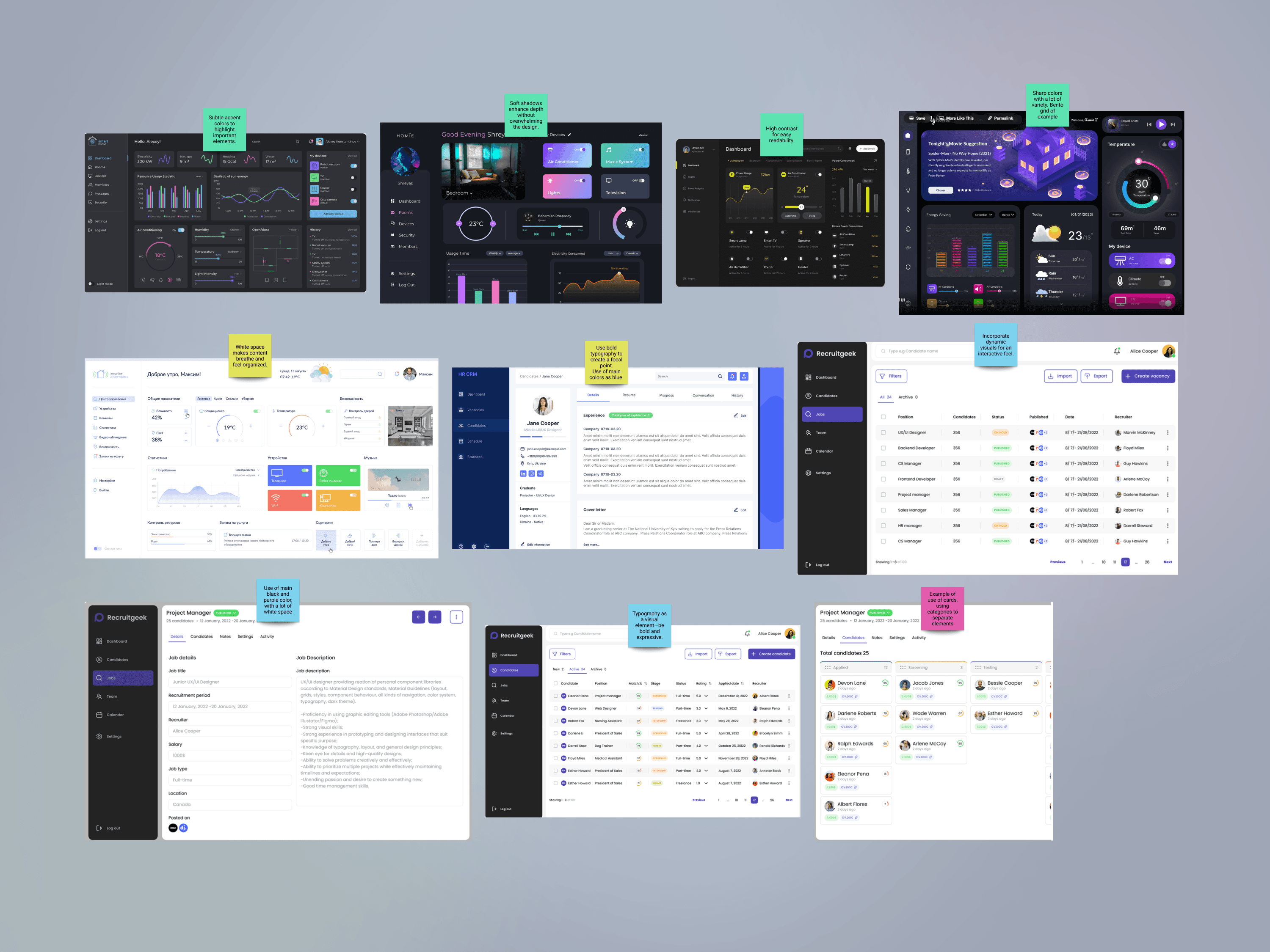
I began by diving into different recruitment dashboards to see what worked and what didn’t. I looked at popular platforms and some lesser-known ones, paying attention to what made them easy to use and where they felt complicated or outdated. This helped me understand what users value most - clear visuals, simple navigation, and a sense of control. It also showed me what to avoid, like overly busy layouts or limited flexibility. This research was my first step in building something better, combining what works with new ideas that could make recruiters’ lives easier.

I began by diving into different recruitment dashboards to see what worked and what didn’t. I looked at popular platforms and some lesser-known ones, paying attention to what made them easy to use and where they felt complicated or outdated. This helped me understand what users value most - clear visuals, simple navigation, and a sense of control. It also showed me what to avoid, like overly busy layouts or limited flexibility. This research was my first step in building something better, combining what works with new ideas that could make recruiters’ lives easier.

Creating an Information Architecture Preview

Creating an Information Architecture Preview

Creating an Information Architecture Preview

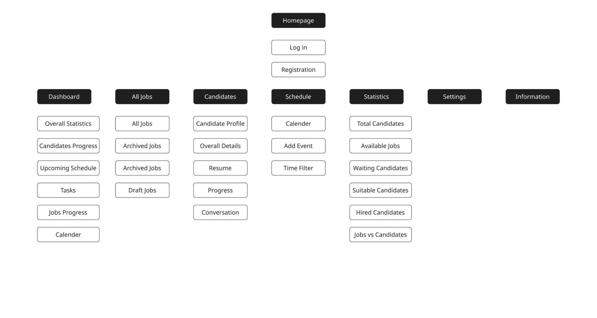
Once I had a good sense of what works, I moved on to creating the Information Architecture. This was like sketching out a plan to make sure everything flowed smoothly. I wanted to be certain that users could move through the platform without getting lost or frustrated. Laying out the main structure helped me see how different sections would connect and where extra support might be needed. It was a crucial step to make sure RecruitHQ would feel natural and easy to navigate, giving users a seamless experience from start to finish.

Once I had a good sense of what works, I moved on to creating the Information Architecture. This was like sketching out a plan to make sure everything flowed smoothly. I wanted to be certain that users could move through the platform without getting lost or frustrated. Laying out the main structure helped me see how different sections would connect and where extra support might be needed. It was a crucial step to make sure RecruitHQ would feel natural and easy to navigate, giving users a seamless experience from start to finish.

Designing the Wireframes

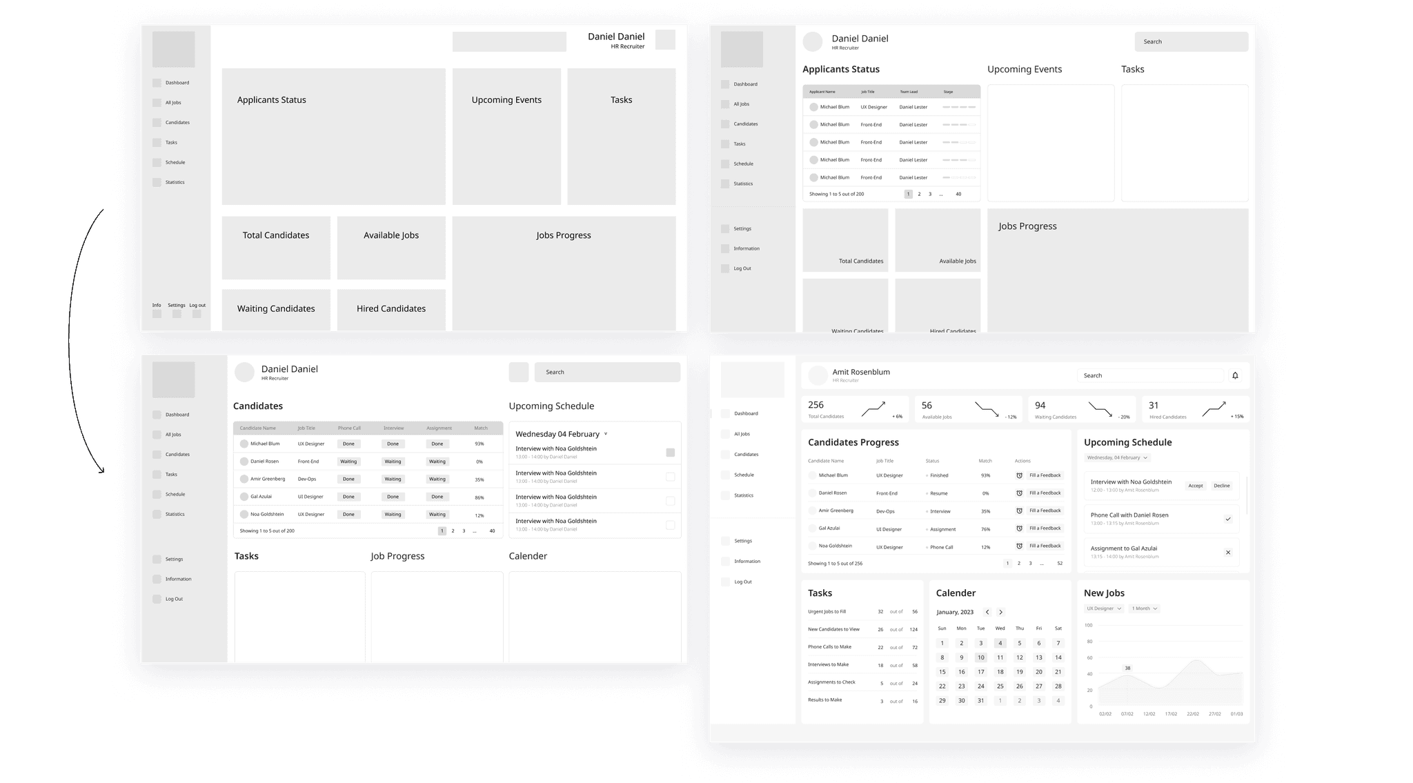
With wireframes ready, I invited real users to test it out, watching where they hesitated and listening to their thoughts. This led to small but impactful tweaks that made the app even easier to navigate. Based on feedback, I adjusted elements like button placement and flow consistency, refining every part to make users feel comfortable.

With wireframes ready, I invited real users to test it out, watching where they hesitated and listening to their thoughts. This led to small but impactful tweaks that made the app even easier to navigate. Based on feedback, I adjusted elements like button placement and flow consistency, refining every part to make users feel comfortable.

Outcome

Outcome

Outcome

After building the wireframes, I moved on to creating the final UI design. To make sure it hit the mark, I tested the prototype with real HR recruiters and gathered their feedback on usability and functionality. This hands-on testing was crucial - it showed me what worked well and where adjustments were needed. The design reduced complexity and aligned workflows, allowing hiring teams to focus on making data-driven decisions. Usability testing highlighted faster candidate evaluations and greater team alignment.

Reflection & Next Steps

Reflection & Next Steps

Reflection & Next Steps

This project really highlighted the importance of finding the right balance between simplicity and functionality, especially for B2B platforms. Looking ahead, adding AI-powered recommendations or integrating with other tools could make the user experience even better and more intuitive.

© Guy Avishid 2024
guyavishid@gmail.com

guyavishid@gmail.com

guyavishid@gmail.com